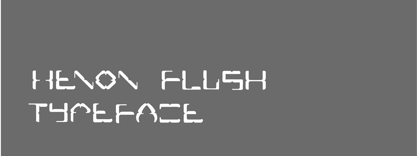
This typeface is an attempt to cherish the magical impact of graphic details in traditional typefaces and challenging the misconception of 'safety' by using all the traditional fonts to prevent risking a project. It also infuses the structured approach to organic shapes and the dreaded use of rounded bold fonts.


The available variables in the form of white space and curvature can be further exploited using the repetition of alphabets along with kerning/ leading settings. The selection of a fixed ascenders and descenders enabled to give the font a more rigid and techno persona. While the type design accentuates the organic curves by using a overpowering geometry , the stylization hasn't completely taken away the legibility of the font .

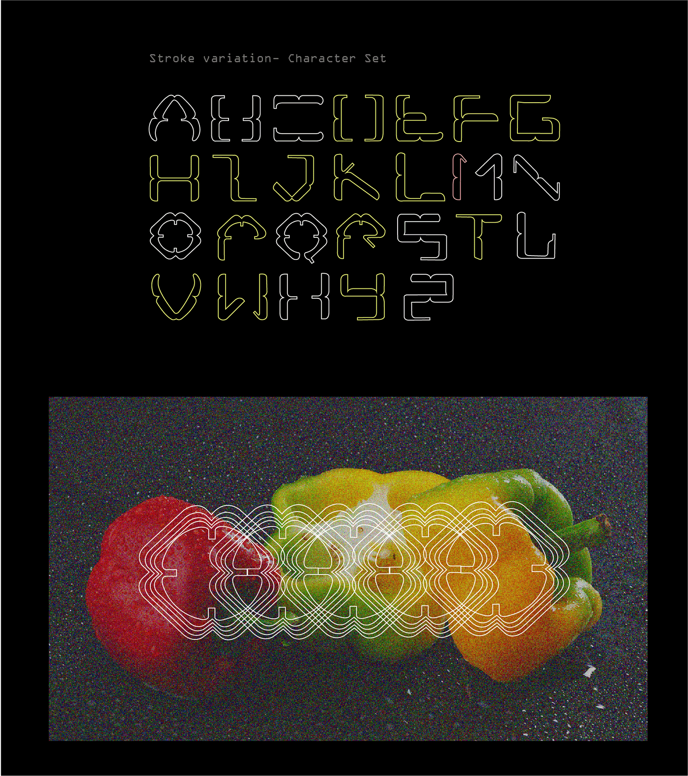
The inspiration for the initial design renderings were drawn from the cross section of a capsicum . Further iterations and explorations helped to narrow down the common design language of the proposed typeface along with a few possible ligatures to test the versatility of the font .
The variable version allows the font to smoothen out the stark symmetry and adds the casual appeal to it's possible usage. The development involved inversion of curves inside out to add modularity to the form and make the transition a valuable creation asset.